Overview
Role: Product Designer
Team: Product Manager, Product Owner, x2 Product Designers, FE Developer, BE Developer, Product Analyst
Problem
Users redeeming a Short Break experience are being directed to third parties to complete their booking. This leads to poor availability, customer service issues, low beneficiary to purchaser conversion and missed opportunities with upsells.
Solution
Create an online platform that gives us full control over the booking journey. This tool should allow users to compare products, have a transparent overview of availability, offer upgrade, and upsell options, and provide superior customer services.
Deliverables
Journey mapping, wireframing, visual design and documentation, follow-up testing.
Key metrics
Booking conversions, NPS score, incremental revenue from upgrades, commissions revenue.
Research
A new Product Team was assembled specifically for this project. This unfortunately resulted in limited time and resources and seeing as the company had a deep understanding of their customers, we compromised on excluding a user research phase to ensure delivery. This approach allowed us to identify the most logical journey for the different voucher types in phase 1, with follow-up testing and further refinement post-launch. If you would like to see a more in-depth discovery process that I have been involved in, then please see the follow-up to this project - Buyagift Spa booking platform.
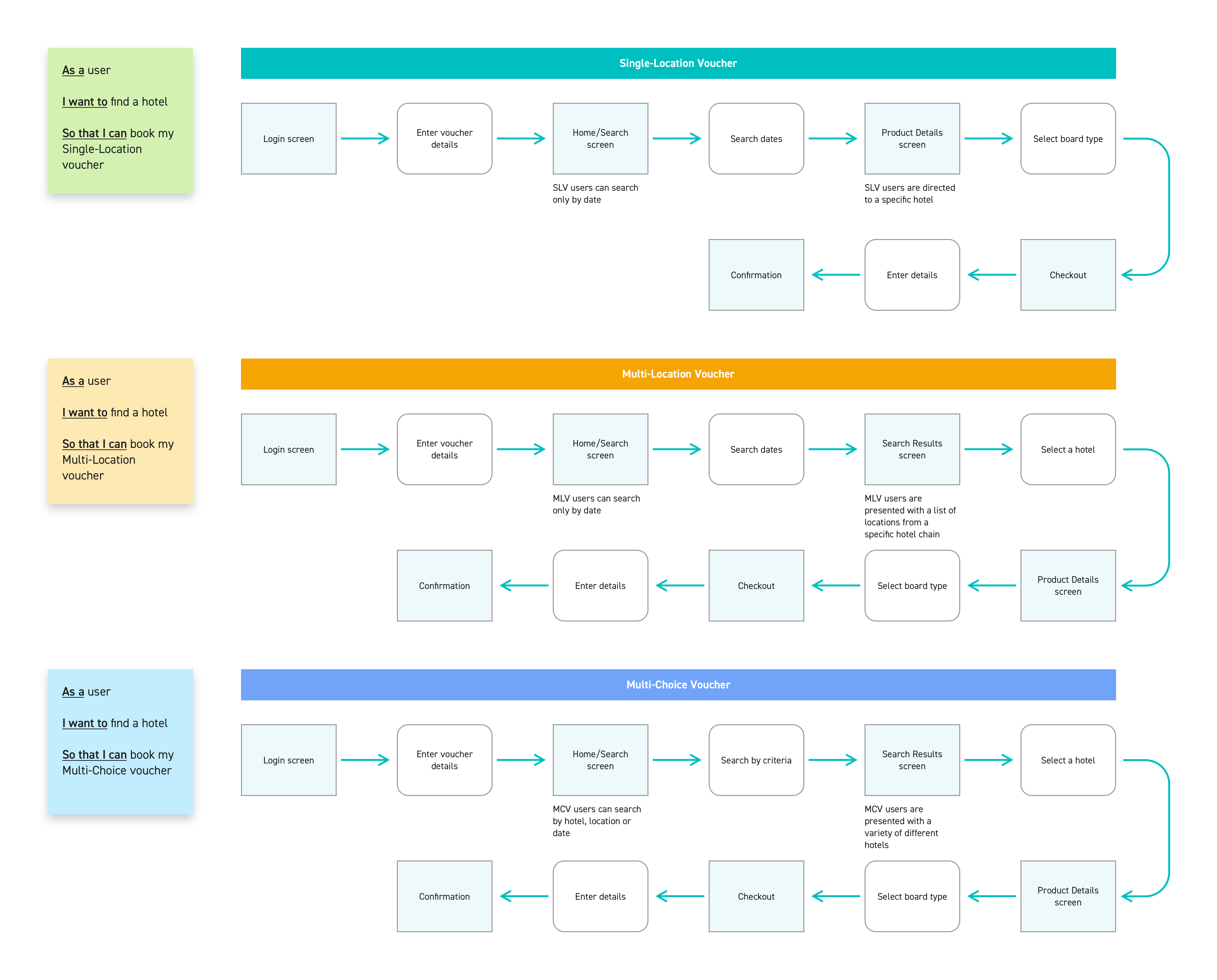
Mapping the journey
There were three types of vouchers that we needed to account for:
- Single-Location: The user can book a specific hotel at one location
- Multi-Location: The user can book a specific hotel brand and choose from multiple locations
- Multi-Choice: The user can choose from a variety of hotel brands and locations
It was important that we started with a clear understanding of what steps and screens would be required to cover all three voucher types. The task flows below show the simplest route for a user to complete a booking with any voucher.
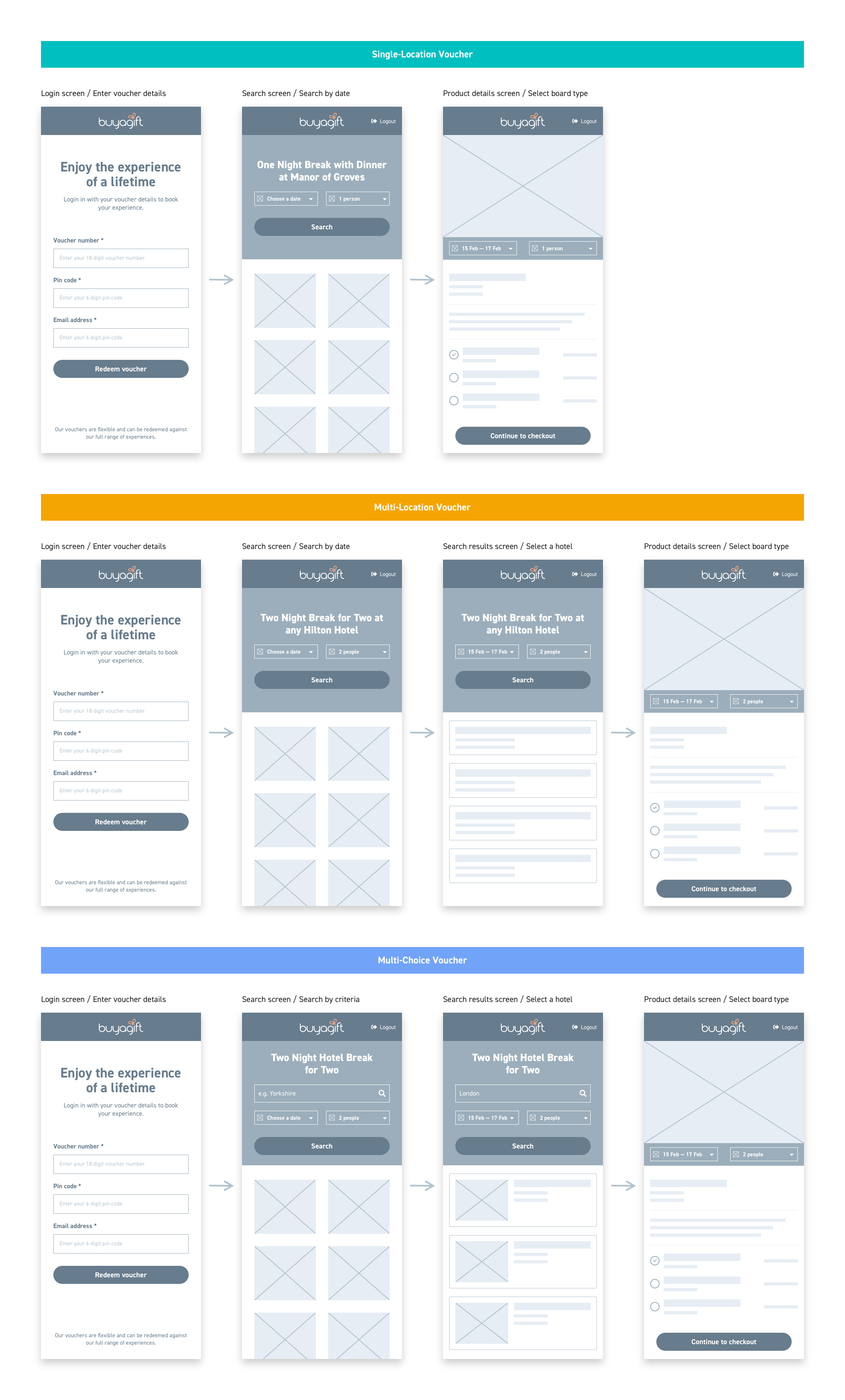
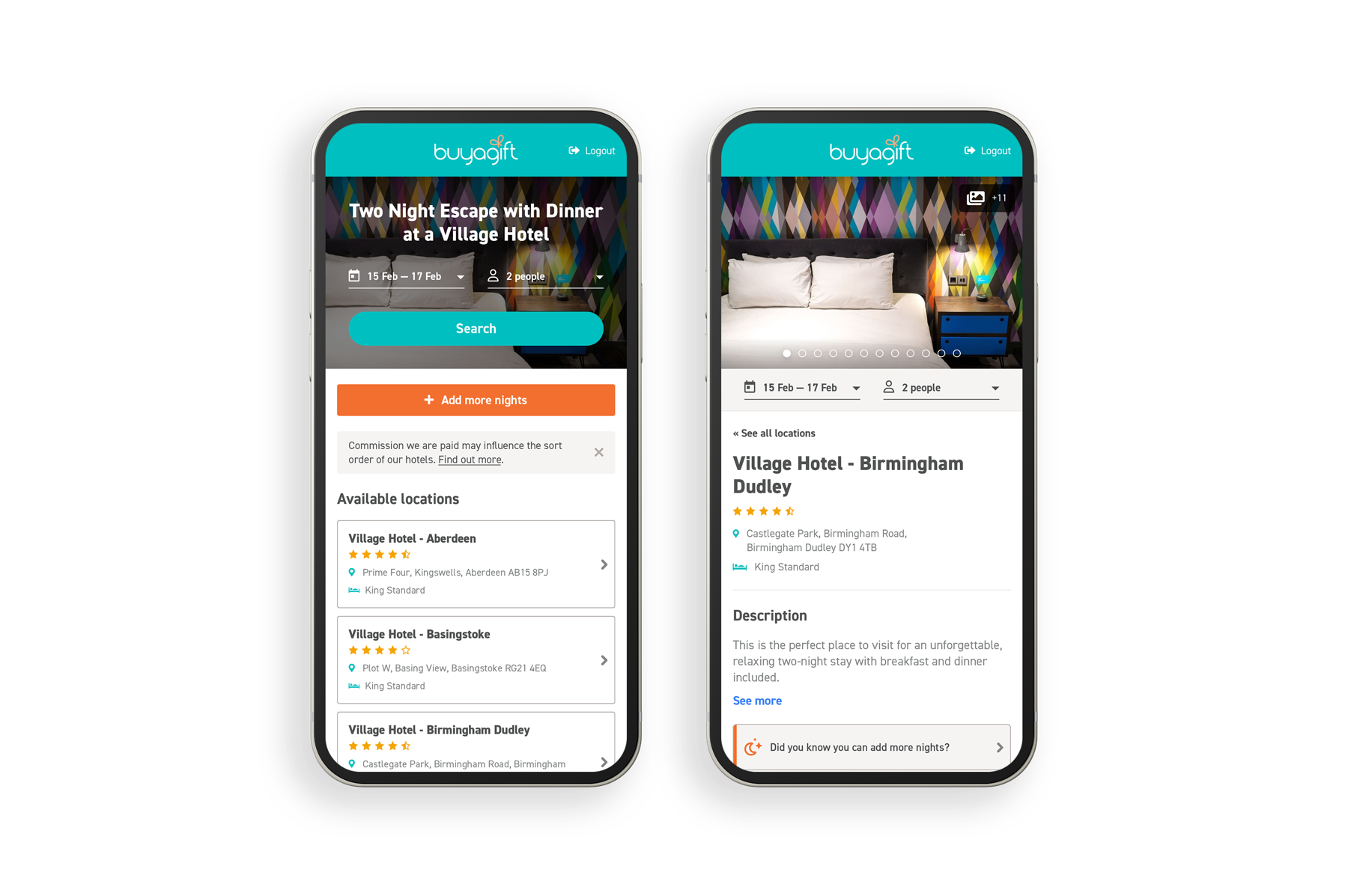
Wireframes
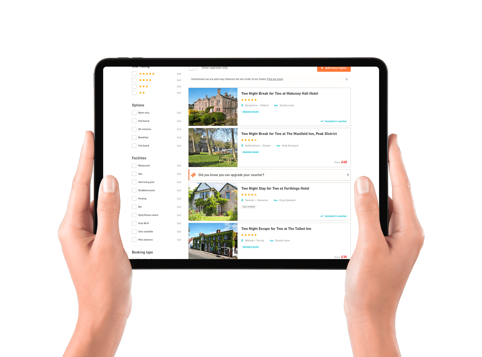
I then went on to create lo-fidelity visuals. This first set allowed for only the basic tasks on the task flows to be achieved. This way, we could start to visualise how our task flow could map onto a real product.
Using our stories and epics I started to provide solutions for more complex user behaviours. The example below shows some of the solutions around upgrades and availability.

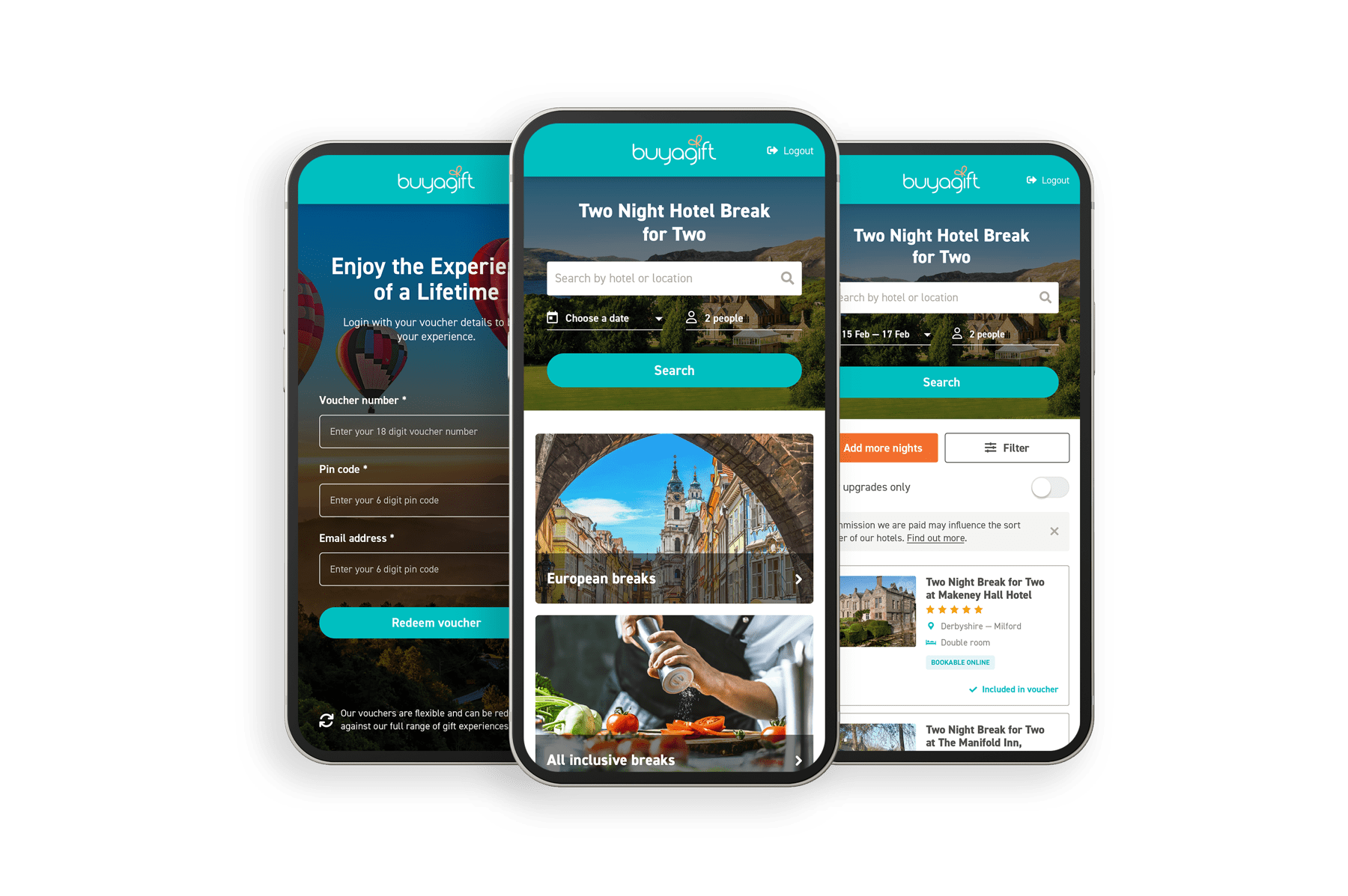
Visual identity
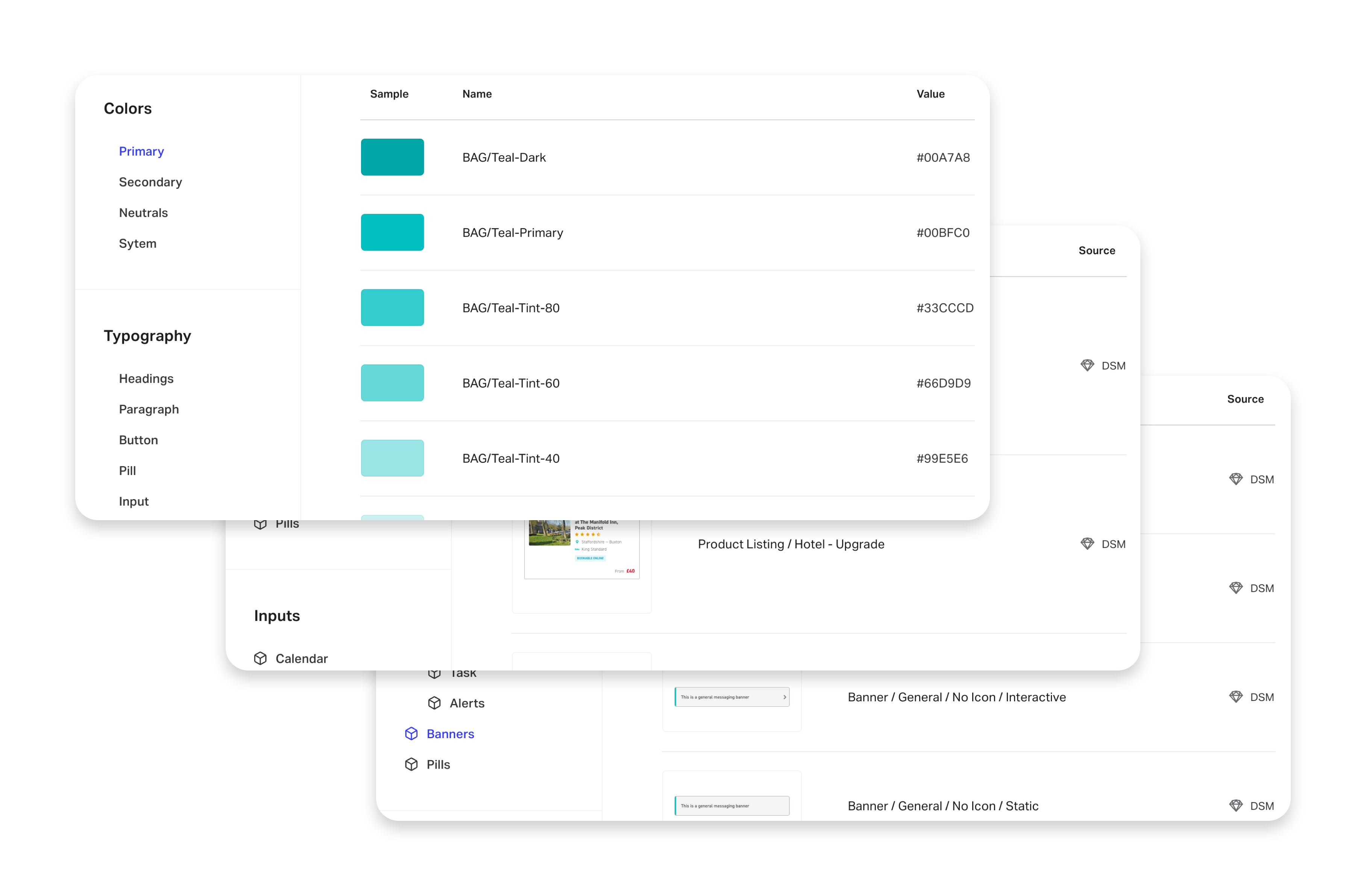
We had the Buyagift branding as starting point to apply a visual identity to our designs. But this was a brand-new site, with a more comprehensive set of rules and regulations in contrast to the front-store platform. With this in mind, we had discussions across the business and decided to view this as a UI restyling exercise, one that would ultimately influence all digital touchpoints. This involved expanding and redefining the colour palette, creating micro-interactions, and global components, just to name a few.

Creating a design system
The existing style guide was outdated and limited. This presented an opportunity to build a new design system that would better serve the needs of the business. This new system could serve as a guide to bring consistency to all digital touchpoints. Whilst the end result was fairly rudimentary, we now at least had the foundations of a more comprehensive system that could evolve over time and serve as shared set of standards for the entire business.
Outcome and learnings
Stakeholders were very happy with the results of this project. We surpassed our year 1 targets and demonstrated the value of Agile working and investment in Product Team methodologies. We now had a product that was unique in the gift experience industry and were given scope to launch additional products for two other experience categories (Spa & Beauty, Attractions & Tours). This also allowed us to expand the team and invest more time into our processes, particularly in user research.
For me personally, I learned the importance of strong communication between different teams, particularly in the early stages. It ensured that we were all on the same page and always moving toward a common goal. Identifying and solving problems before wireframing was another important takeaway. I saw how even lo-fidelity wireframes can blind you to a simpler solution and discovering these issues in the early stages really helped to avoid setbacks.