Overview
Role: Product Design Lead
Team: Product Manager, Product Owner, Product Designer, FE Developer, BE Developer, Product Analyst
Problem
Users redeeming an Attractions & Tours experience are being directed to third parties to complete their booking. This leads to poor availability, customer service issues, low beneficiary to purchaser conversion and missed opportunities with upsells.
Solution
Create an online platform that gives us full control over the booking journey. This tool should allow users to compare products, have a transparent overview of availability, offer upgrade, and upsell options and provide superior customer services.
Deliverables
User stories, Journey mapping, Wireframing, Visual design and documentation, Follow-up testing.
Discovery
We started with moderated user interviews split between three product categories – Driving, Amusement and Attraction. Through this process I got a better understanding of a typical users needs and thought processes.
Here are some of the things we learnt:
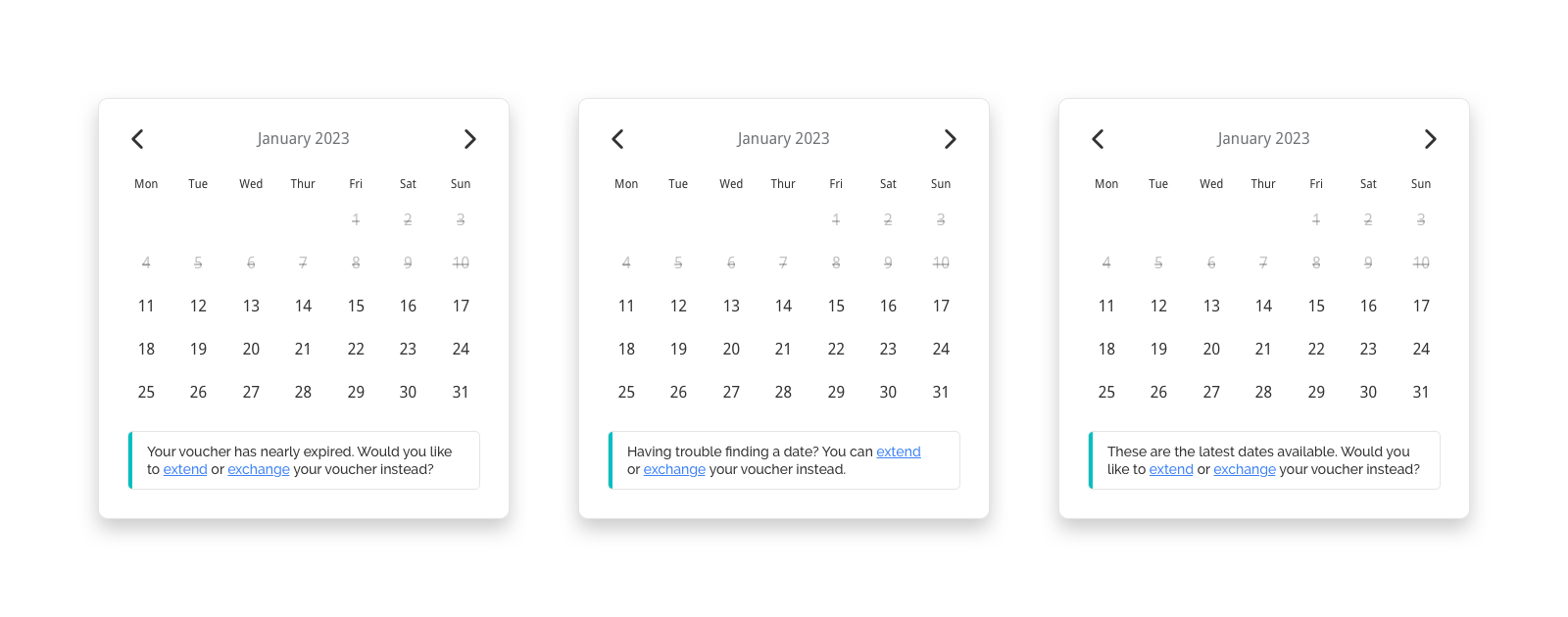
- Clear information on the gift voucher can play a key role in redemption rate – currently, more than half of vouchers are never redeemed! Users want to be aware of validity, extensions, and exchanges
- Users will often plan a day or weekend around Attractions & Tours experiences. This can include hotel bookings, dining out or other attractions, all of which are existing product categories on the front-store
- Additional planning can include an itinerary for the day, setting reminders, researching the local area, and planning the journey
- An online booking is greatly preferred to booking over the phone
- Add-ons and upgrades are something that users expected to see and were more than happy to purchase. They saw this as an opportunity to make the most out of their experience
- Users also stated that add-ons and upgrades are more likely to be purchased through online booking than at the location. Hard sells by staff or being stung with additional costs upon arrival will be off-putting
- Posting to social media during and after the experience is very common

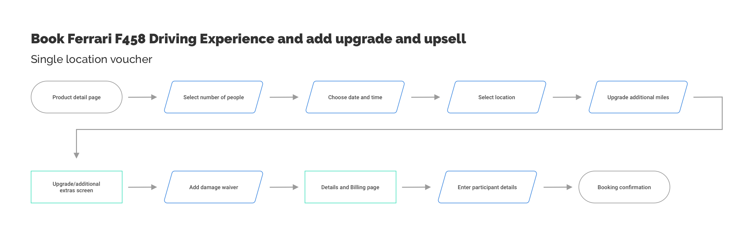
Mapping the journey
Next was to map out our new journey’s. We needed to accommodate for a wide range of different products that each had their own unique options and upsells. Here are two examples of those flows.

Solutions
Here are some of the problems we solved through the discovery phase learnings.
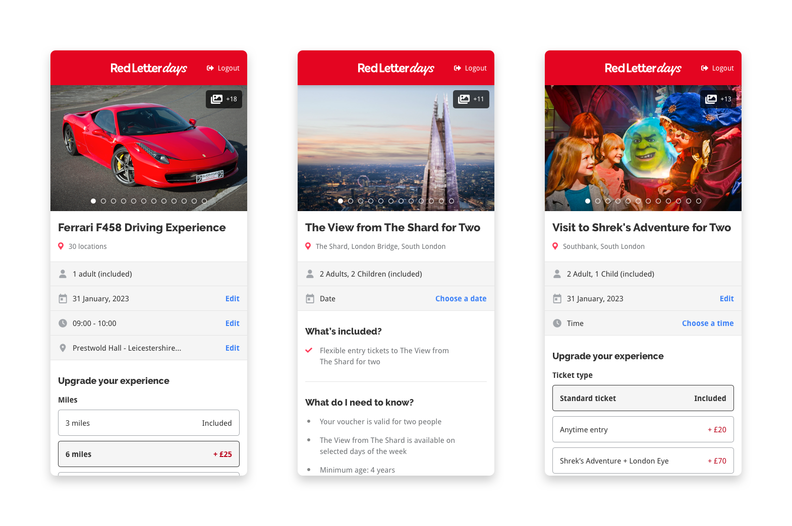
Action panel: Users are faced with a vast number of options to choose from. For this reason, we moved away from the modal design used in the previously completed Spa & Beauty booking journey and instead created and all-in-one ‘action panel’ where users could select all of their options on the product page.
Upgrades: User feedback indicated that the option of add-ons and upgrades through the booking is preferred and expected. We still felt that a distinction between them was required and therefore used different placement and treatments for each.

Voucher alerts: We needed to remind the user of their voucher flexibility. We implemented this into the calendar with strategically placed messaging.
Follow-up emails: Users put a lot of planning into their day out, we decided to give them a helping hand in our follow-up emails, providing reminders, itineraries and more.

Final designs
When creating the final designs, I worked with the booking journey design system created for previous booking projects, adding new components in the process.


