Duarte: Website redesign for a communication consultancy and training company
Wireframing
User Research
Introduction
Duarte have helped bring life to some of the world’s greatest presentations, working with the likes of Apple, Adobe, and Microsoft, just to name a few. During lockdown they ventured out into online learning, something that was playing an increasingly large role in their business. With this in mind Duarte decided that they needed to completely reimagine their website and user journey.
The goal of this project was to create a journey for both learning and consulting users all under one roof. The client also wanted a 'living and breathing site'. My role in the project was to conduct user research, run user tests and create wireframes that took learnings from the discovery process to create game-changing new website features.

User testing objectives
- Understand what steps a user takes to enquire about a service, how much information they need and what pain points they experience along the way
- Understand what steps a user takes to enrol in a course, how much information they need and what pain points they experience along the way
- Identify what’s working well on competitor sites and how we can improve our journey based on this information
- Discover the language and terminologies that users understand and relate to
- Through user pain points discover potential new website features that improve the overall user experience
- Gain insight into a way that we can effectively consolidate information

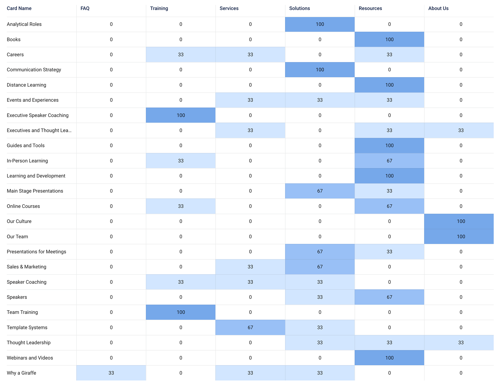
Tree testing
The tree testing results uncovered some issues with current categorization and titles.
- Services performed poorly on the tree testing – a total success rate of below 70% for nearly all tasks related to Services.
- Training performed well – most users correctly located Training items. Many Services items were placed under Training, which could be an argument for consolidating the number of parent categories.
- Resources had an average performance with has a success rate of below 70% but was correctly located by most, even if it was indirectly via another parent nav item.
- Solutions seemed to be quite vague. Users placed items from service, training and showcase under here. It seems like the term could be applicable to all.

Card sorting
From the card sorting results we have identified further issues with current categorization and titles. My solution is to consolidate and streamline the existing categories to avoid a top-level choice paralysis. A mega-nav would also be a way to consolidate categories in a simpler way.
Site mapping
I created a new site map that would remove unnecessary items that could then be swapped out by more useful items.

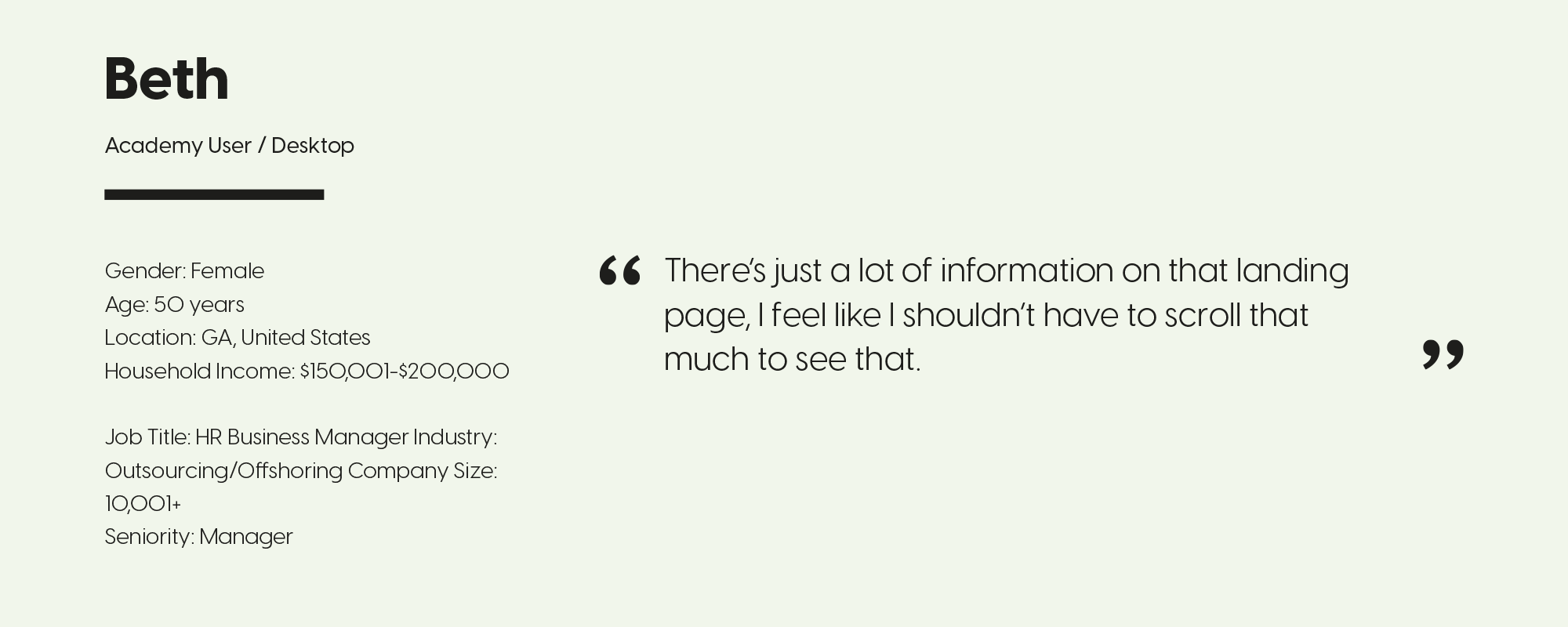
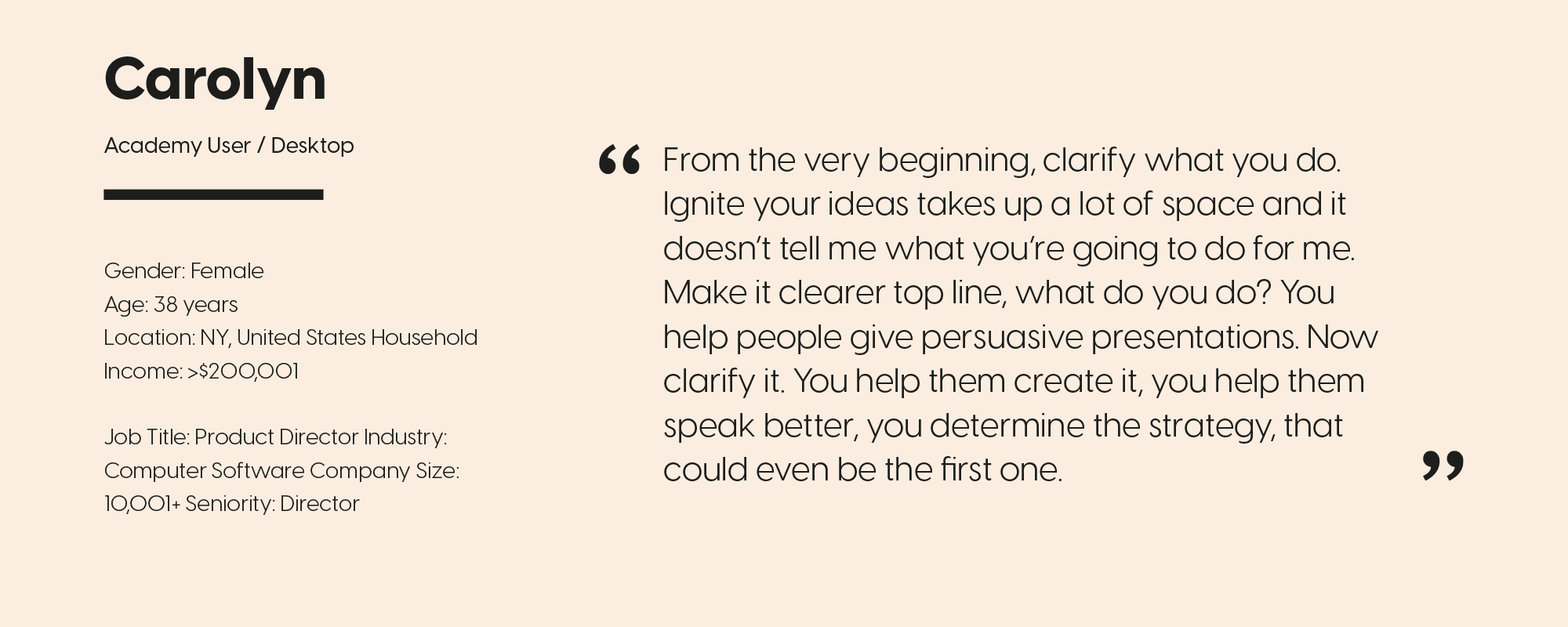
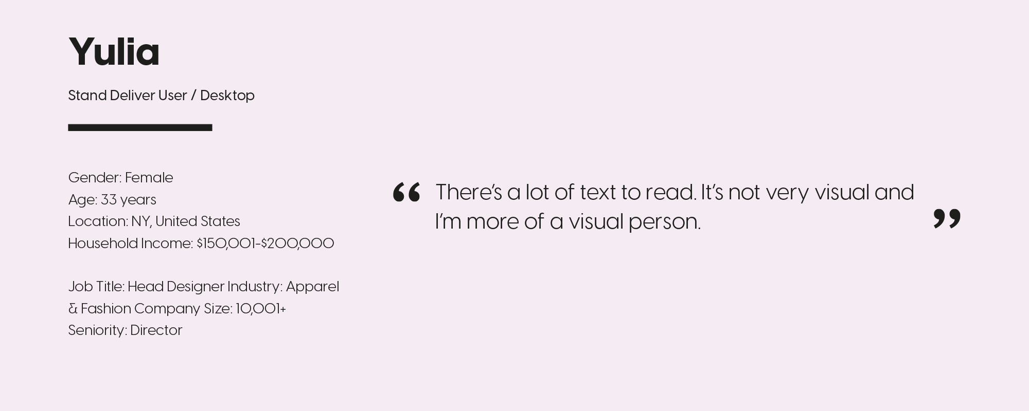
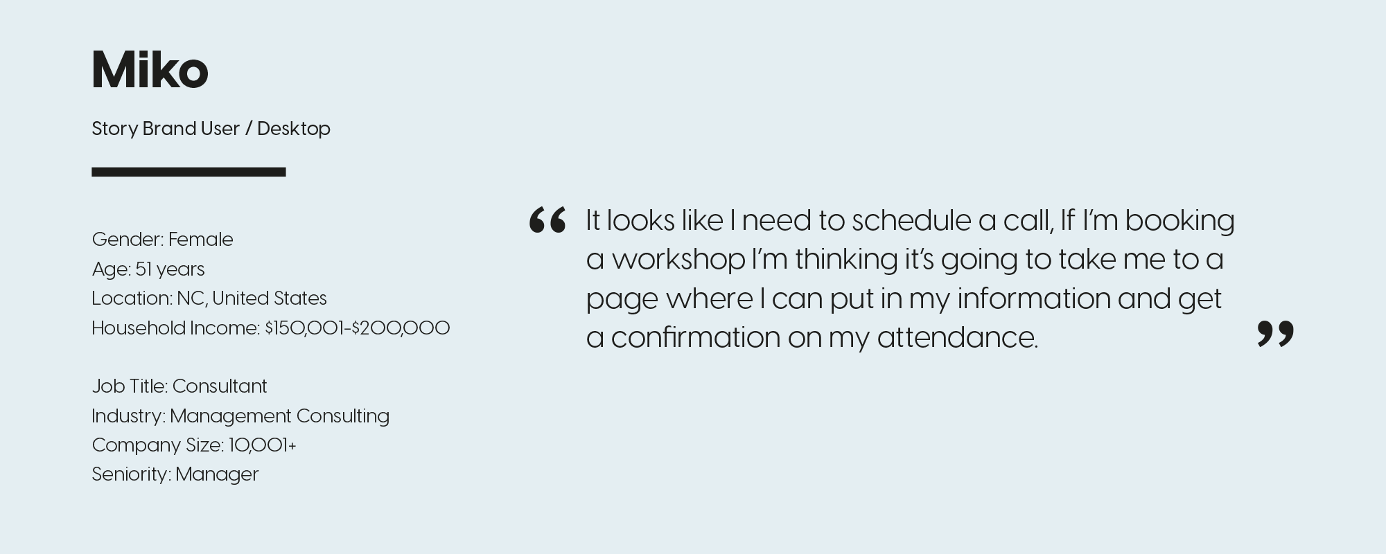
Unmoderated testing
Our participants provided valuable feedback while speaking their thoughts out loud and sharing their screens. We monitored users on the current site and two competitor sites.

Solutions
I proposed several solutions based off my findings in the discovery process:
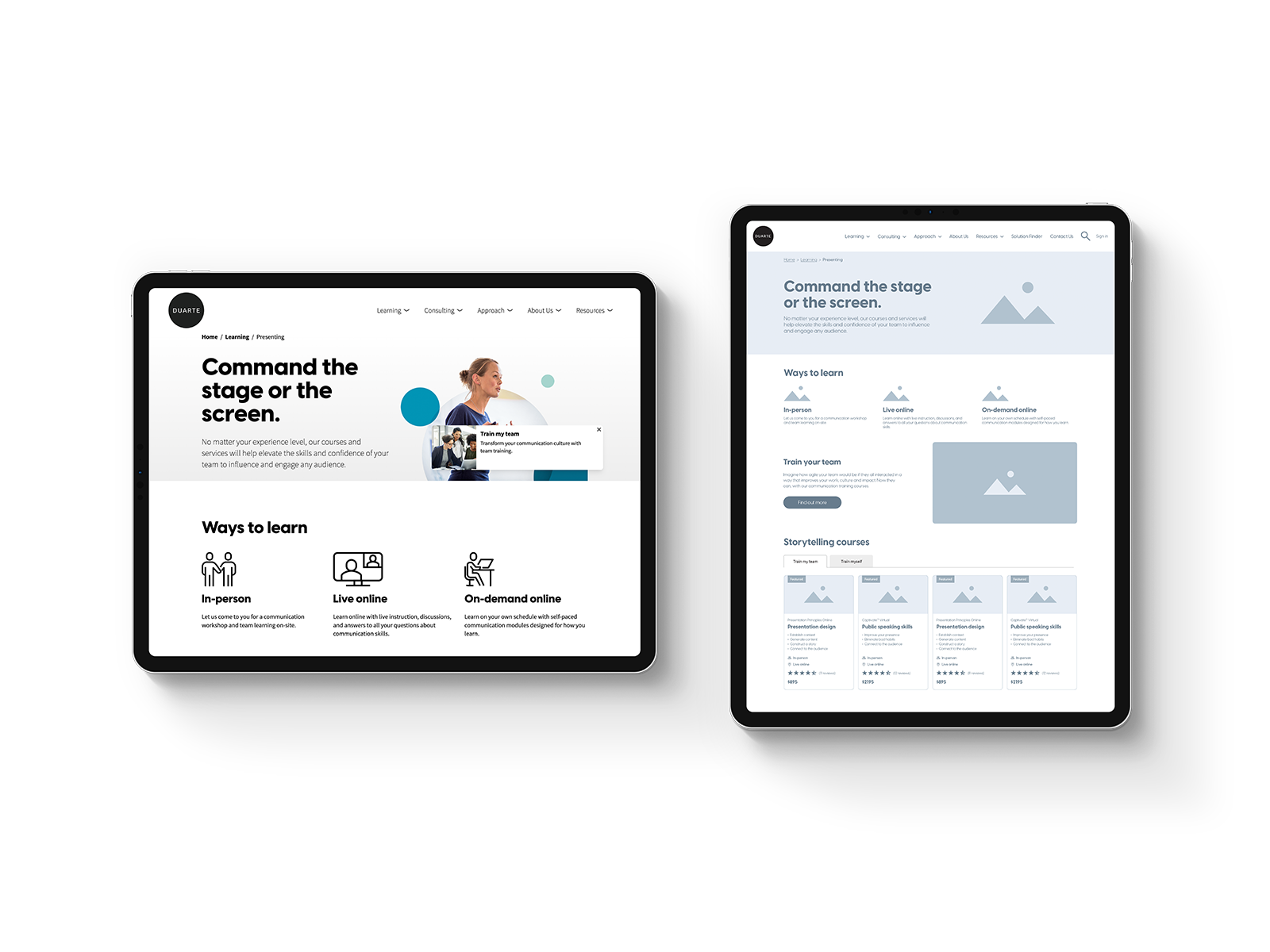
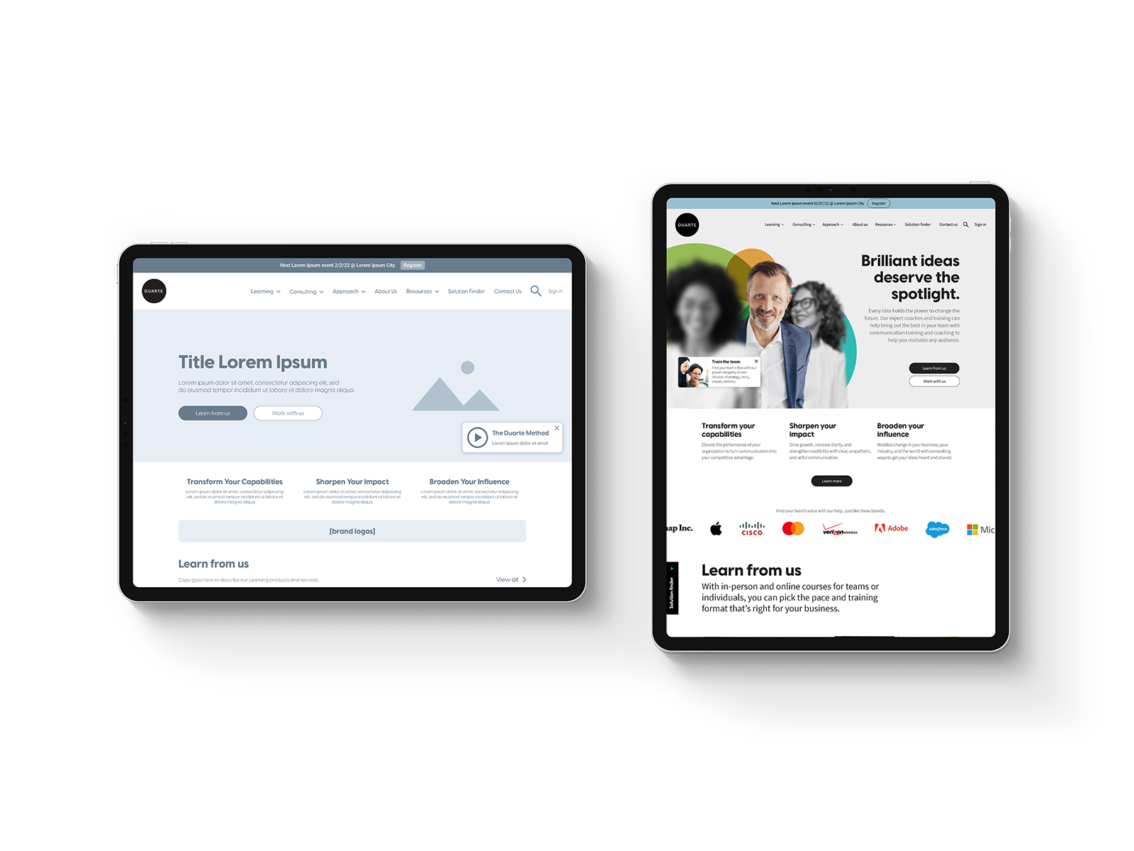
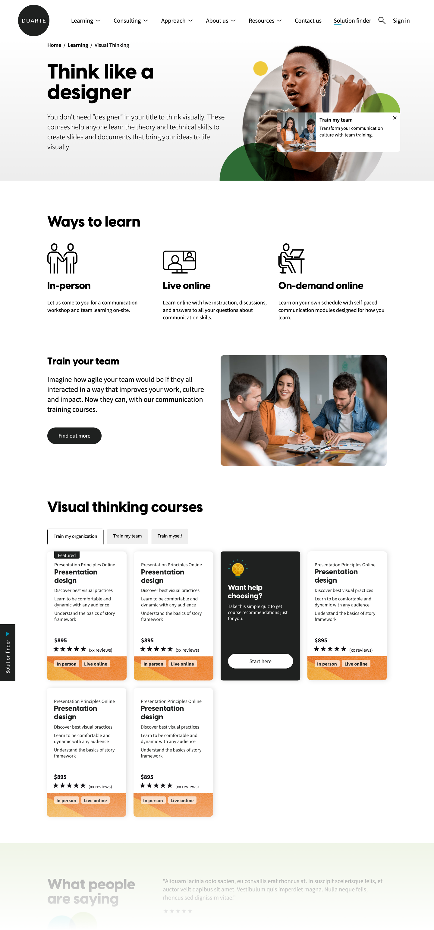
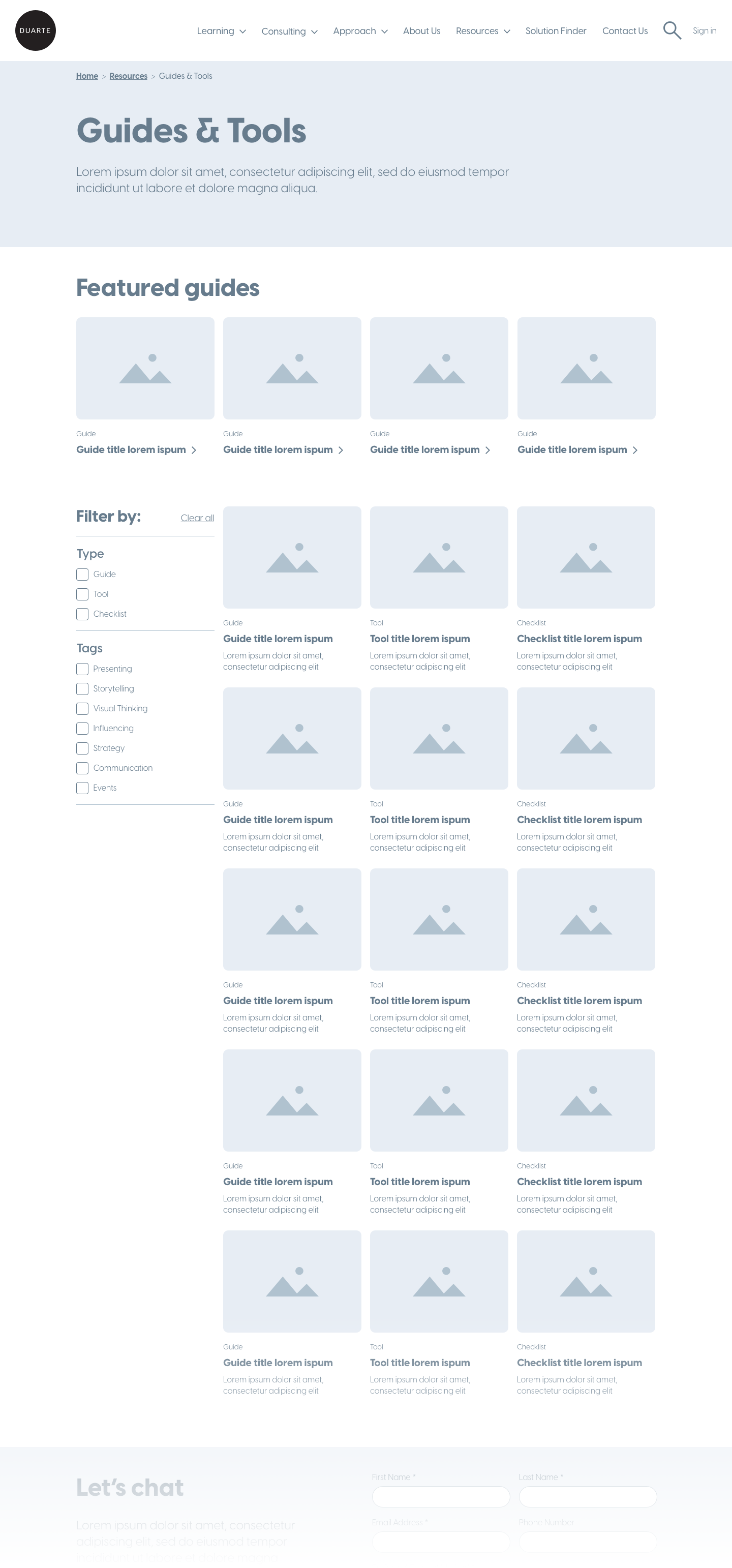
Mega-nav: After successfully consolidating the number of pages on the site we were still left with a relatively large site. By implementing a mega-nav I was able to make use of wasted space and add sub-category links that would provide context and get users to their desired page a lot quicker. It also created additional space to include promo pods that could be regularly updated with relevant content, something that helps create the feeling of a 'living and breathing' site, as requested by the client.
Solution Finder: Users seemed to look for a tool that lets us do the heavy lifting for them based off their needs. I mocked up what we decided to call the 'solution finder', a tool that can direct the user to a bespoke set of courses and other helpful materials.
Other solutions include:
- Page hierarchy: We needed to create a familiar and easily scannable page hierarchy across each page. Creating familiarity across the different pages will help the user to learn the site faster.
- Improved footer: Testing on a competitor website we found that the user was relying a lot on the footer to navigate the site. It’s not limited to height as there is nothing below it, so it makes sense to utilize this space as a kind of secondary mega-nav.
- Guiding the user at every stage: We learnt from a competitor site test that repeating important information throughout the site or page is a massive help in guiding the user. It serves as a constant reminder; we’re saying to the user that ‘this is important information!’, or ‘this is what you need to do!’.
The end result
This project is still be developed, below are some screenshots of what will be going live in the next month.